Showing posts with label BRIEF 09. Show all posts

Sunday, 14 May 2017

Extended Practice / Module Evaluation

Extended Practice has been an exigent and dynamic module that has given me an insight into my specialism through a variety of briefs. This allowed me to determine which briefs worked well and which did not, through analysis and evaluation. The briefs varied in scale, meaning I gained experience with working with shorter, fast paced projects, alongside projects which took 6 months. 

Diligent time planning  ensured the projects ran smoothly especially when some of them overlapped, although there were many things out of my control that resulted in me having to think on my feet and adapt; such as professional services not printing samples in time, or content not being sent by the client for long periods of time. This allowed me to gain knowledge in planning ahead and being prepared. This is a skill that can be taken forward for industry, as there will be times where I will be working on multiple projects in the future. 

The module demanded skills within problem solving, such as when things did not go to plan, for example within the Ceramics brief. Many prototypes broke, which resulted in me having to discuss new ideas on how to approach the next set to try and produce something successful. This also included problem solving within other editorial briefs, for example producing the publications and considering stock, binding and other treatments to ensure all error was avoided. Experience with this is helpful for after graduation, when things may go wrong or not work, and I must approach the brief in new and more effective ways to generate a successful resolution in the end. 

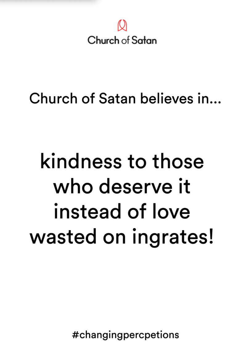
Research and contact/communication was another crucial aspect within Extended Practice. A lot of briefs needed primary research and contact from other sources, for example contacting sources for the research brief, conducting surveys and research to establish aims/goals/things to avoid and contacting potential collaborators. This was especially apparent within Brief 05, when I needed external collaboration in terms of producing content for the magazine, and Brief 09 when conducting research and testing the successfulness of the branding resolution. These skills can be taken forward after university, as communication and contact is always a beneficial skill to have within the creative industry. 

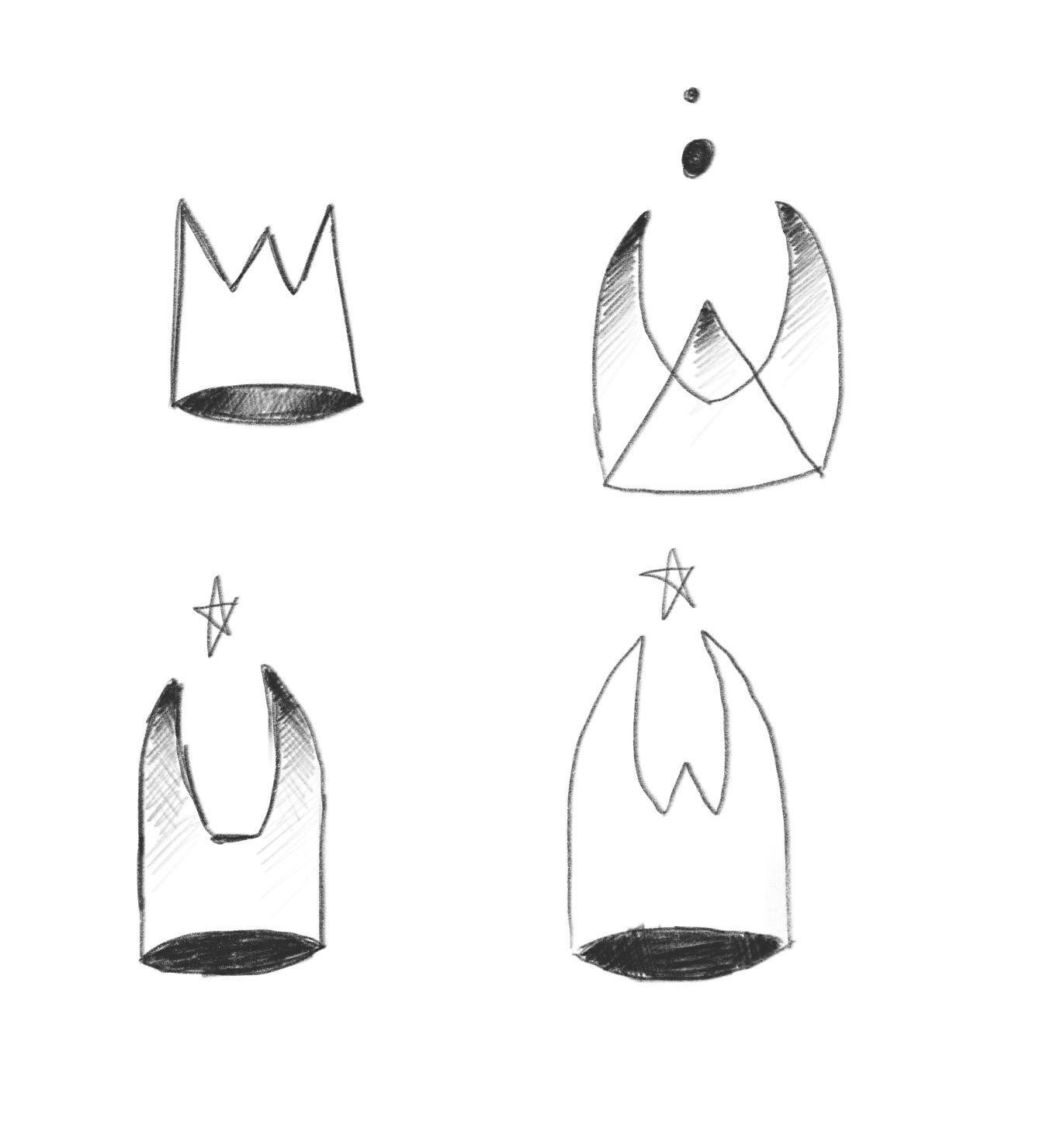
Throughout extended practice I feel I have attempted to produce resolutions that are as professional as possible, whether that be through professional printing services or ensuring effort and time was put into producing high quality design resolutions. As a result I have predominantly been proud of the projects I have completed for the module, and feel they have allowed me to explore editorial design to a greater depth, along with other design practices such as branding and identity, another area which I am interested in. 

The module has also allowed me to discover an aspiration in producing my own magazine, something I have been wanting to do in the future, and allowed me to put this into practice in it’s first stages. Demon Magazine has become a passionate project of mine that I hope can be explored further and developed again after university to hopefully become successful in the future. 


Overall I am proud of the effort put into Extended Practice and feel I have evolved as a designer, communicator and creative thinker, and will hopefully be able to translate these skills I have gained into the industry next year.

Thursday, 11 May 2017

Church of Satan / Book Cover Redesign & Leaflet

Satanic Bible Redesign

Leaflet (External) 

Leaflet (internal)

One of my responsibilities within this brief was the print based materials. I redesigned the Church's bible utilising the strong identity we have created, showing consistency throughout all of the deliverables.

The current Bible design perpetuates the 'evil' stereotypes associated with the Church. The redesigned cover is clean, utilises white space and looks fresh and inviting. The leaflet also adopts this aesthetic, using the colour palette chosen. It explains the campaign in a friendly and conversational manner, in order to appeal to the broader audience who may be put off by Satanisms current aesthetic. The leaflet informs the audience about the self worship campaign, and shows it as an appealing and beneficial thing to do.

Church of Satan / Feedback Research

With our finished resolution, I used twitter polls to ask a young demographic (the predominant audience who follow me) some questions.


I attached a photo of the finished identity and asked the following questions:


Then I attached the current church branding and asked the following questions:


Although the first question could be a little misconstrued (people may just think I'm asking them if they're interested in Satanism), this feedback is incredibly successful. From the poll shown, it tells us that with the rebranded identity we have produced, more people would be inclined to explore Satanism, rather than their current branding. The poll shows that with our identity, it is more friendly and approachable which is what we set out to do.

Although the identity may not appeal to a lot of people due to the name still, I feel this is still a success for the brief, and due to testing this, we now know this has completed our aims for the project.

Church of Satan / Evaluation

The Church of Satan brief was a collaborative project conducted by myself and Jack Solomon. The brief was an extensive rebranding project, involving the creation of a new identity for the Church of Satan, the most public Satanic organisation originating from LaVeyan Satanism. Within this, a new campaign for the Church was also created. A variety of deliverables were produced, including a new identity (logo, icon), website, campaign video, t-shirt, bible redesign & campaign leaflet. In terms of responsibility, myself and Jack split the deliverables between our skills. Jack is digital based and enjoys working with those aspects, therefore he worked on the website. He also concerned himself with the posters. I am more print based, therefore I worked on the Bible redesign and leaflet. Due to a recent passion for video, I also edited the promotional video for the campaign. 
Creating the video increased my skill and competence within After Effects software and using video footage shot by myself and Jack. We asked two participants to speak about “Self Worship”, therefore the footage was our own, and came about organically. The project also resulted in my skills evolving within branding, and creating a resolution that was conceptually sound rather than just focusing entirely on stylistic areas. It was enjoyable to apply our identity to new deliverables, such as t-shirts, and see it come to life from paper. 

I felt this brief furthered my collaborative skills and time management, due to working with someone who has a great work ethic. This was rewarding to see the brief develop through hard work and perseverance, and through pushing ourselves to produce something professional and of a high standard. Professionally was an aspect we both felt strongly about, as the resolution would be for a large organisation. Considering the context and audience was also important to our final resolutions, developing aims for the project helped to direct us into a successful design which solved the brief. 

Problems included working within a short space of time on the video, and making use of the facilities that we could. During the filming process, students taking photos in the studio next to us were extremely loud, which disrupted our footage and also can be heard in the video. This could have been solved by using a soundproof room, or having a higher budget to produce a higher quality video. The backdrop also contained a large stain which could not be removed on the day of filming, but using intuition and a bit of editing, this problem was minimised. 


The most successful aspect of the brief was our time management, and our logo. The logo effectively resolves the brief by providing a new, current and inviting identity to the Church of Satan, which would attract a broader audience according to feedback. It was felt that all our deliverables for the brief were produced professionally and to a great quality. Overall it was an excellent project to work on, and did not pose any large problems throughout, successfully immersing me in new skills and approaches.

Church of Satan / Tshirts

The logo was printed onto t-shirts, displaying ways the logo can be applied to various deliverables and merchandise for members.


Church of Satan / The Self Worship Campaign

The Self Worship campaign communicates the ideology that you are your own God - a notion that originates from LaVeyan atheistic Satanism. Satan is a symbol that encompasses what the religion stands for:

"The only "god" in LaVeyan Satanism is the Satanist himself. Satanism is a celebration of the self. It encourages people to seek their own truths, indulge in desires without fear of societal taboos, and perfect the self." source 

The campaign aims to promote positivity through the act of worshipping oneself. This acts as the umbrella term for methods of feeling powerful and loved by yourself; i.e self love, self confidence, self respect. The campaign displays the Satanist wearing a crown, which is the updated Church of Satan logo. The crown representing self importance, that you are the one in charge. 

This campaign is successful in comparison to the Church's current identity and approach, as it promotes the act of self worship as an attractive trait which benefits the individual, and does not scare them away with too much emphasis on the word Satan, or any 'evil' aesthetics. 

Church of Satan / Initial Ideas / Logo


To begin, we needed to establish a solid new identity for the Church. We began by generating concepts around the religion as a whole. During research we really delved into what the church was about, and the consensus is that the individual looks out for themselves. There is no God, but you worship yourself. This lead onto using a crown within the logo. The crown represents royalty, importance and egocentrism. For Satanists, you are the most important person. 

These sketches were then narrowed down and refined, and finally adequate for digital development. 


Church of Satan / Initial Ideas / Campaign


The Church’s website in its current state, is very unwelcoming and isolating. We needed to generate a way to engage a wider audience. Through sketching and discussion, we came up with a campaign stemming from the basis of the logo, named the Self Worship campaign, depicting the member wearing the crown logo on their heads. This represents the religion, by using the official logo, and also represents self worship and importance in the self.

The second idea we came up with was titled “Changing Perceptions”. From research, we gathered that the attitudes towards Satanism are predominantly negative, and many believe the Church is evil. If anyone was to read into the truths of the Church, it would become clear that this is not the case. These posters contain vital scriptures from the Church, shown in a friendly and inviting design composition. 

We felt the Self Worship campaign was  more effective and could be pushed further using photography and video in the developments. 


Sunday, 7 May 2017

Church of Satan / Campaign Video


The campaign video contains the narrative of two church members who are informing the audience on how self worship within the Church of Satan has positively changed their lives, and what the term means to them.


Aesthetically, the video is current, utilising bright colours in reference to the determined guideline palette. The candid footage of the participants is informal and shows a new side to the Church that some may not expect, offering a free and liberating experience through laughter, smiling and dancing. Self worship is shown to be an exercise that greatly improves the human experience and draws the audience in through the promise of benefits. The participants humanistically tell their own story, providing personality and reliability through their own experiences. 

Church of Satan / Primary Research


The first question showed the participant the 9 satanic statements, without the key word "satan". Without this, the phrases do not seem so off putting and hold quite a lot of logic. The participant is asked their first thoughts after reading these. 

It was interesting to see that people did agree with these statements, but they did not know where they stemmed from. 


The participants show that the majority would seek these statements in their everyday life, proving that the statements are fair and appealing. 


When asked what people know about the religion it is interesting to know that some may think Satanists worship the devil, when this is not the case at all. These are the attitudes that found through this research we aim to change. 


Many seem to have a negative opinion on Satanism which again is something this brief aims to tackle and change for the better. Satanism does not have to have such negative connotations because what it stands for is statements that anyone could make, logically. 


"Possibly but I wouldn't ever want to label myself as a Satanist" is particularly interesting, as this phrase obviously holds so much negative connotations, even though it preaches loving yourself and worshiping yourself, looking after 'you' and respecting other humans and animals. These are all qualities humans wish for. 


From the research we gathered that there is infact a lot of negativity surrounding the Church of Satan. Taking into consideration some of the comments, we made aims for the project. The project should focus on a positive campaign which can appeal and engage an audience, without mentioning the word 'Satan' until the end within a promotional video, and hardly mentioning it within other deliverables. Without using this name, it will not put anyone off initially.

Saturday, 6 May 2017

Church of Satan / Final Logo


The final logo for Church of Satan adopts a friendly professional typeface with varying weights to create depth and focal points. This typeface is inviting and much friendlier than the original logo that exists for the church. 

The icon for the identity is a crown which subtly represents ‘devil horns’. The shape is proud, elegant and communicates the core values of Satanism, that you are your own god and worship yourself, not any other force, object or being. Satanism represents the self, and the crown effectively conveys this through the connotations of royalty and pride. The abstract structure is modern and clean, the minimal elements update the current logo effectively.

Church of Satan / Developments


The first stage of development was experimentation with typefaces to secure a friendly identity. To achieve a more informal and friendly tone of voice as found within research, sans serif typefaces were the most appropriate option.


 In the end, ano bold and regular was suitable because of it’s rounded form, professionality and readability. 


Next was colour choices. Through research we found that LaVeyan Satanism originated in Germany. To pay homage to that, we experimented with various tones of the german flag colours. We tried elements of germanic blackletter within the logo, but found this inappropriate to the brief because of its harsh structure. 


During research it was found that the current logo for the Church of Satan was off putting because of it’s negative connotations, so a new logo was created within the brief. This included simplifying symbols associated with the religion and experimenting with gradients  to create vibrancy and fun. 

Jack had sketched some ideas around using a crown to represent the idea that within LaVeyan Satanism, you worship yourself. This was the most suitable and effective logo and this was developed into our final outcome. 

Church of Satan / Websites / Christianity


Websites with information on Christianity were also beneficial to look into, as this religion often correlates with being ‘good’ and ‘pure’. Rethinking how the Church of Satan can still adopt it’s same content, but appear more friendly and pure in aesthetic, is the main aim for the project. 

In contrast to the Church of Satan website, the majority of Christian websites we visited had a dominant colour of white, associated with pureness and 'goodness'. The colour provides clearness and space, and looks more friendly and inviting. 

The fonts used are friendly, and are mainly round sans serif, or classic serifs, there is nothing too decorative about these websites, and most of them are quite modernised compared to Church of Satan, which can look quite archaic and outdated, again which will put people off initially. 

Most of the websites also have their own logo, providing a sense of reliability and professionalism. 

Through this research it is now clear on how to approach our brief in terms of applying treatments such as these websites to create a friendlier interface and identity which will engage a broader audience than the niche audience the Church of Satan already has, and prevent a lot of misunderstandings on what the Church is about. 


Church of Satan / Research / The Church


Research began by looking at the existing Church of Satan website and collateral and identifying the problem areas. This included the colour, logo and overall structure of the website. The identity of Church of Satan can immediately put people off by the harsh gothic details, and the focus on ‘Satan’ as a being, even though this is not included in their philosophy. Through this research we were able to identify the elements that needed adjusting in order to connect with a broader, younger audience.

Examples include the giant header image for the website, including the logo for Church of Satan. The logo is written in an art deco style font, with a baphomet as the logo. Immediately, this is 'satanic' symbolism which would put a lot of people off from going deeper into the website.

The dominant colour of the website is black, a colour commonly associated with dark arts and themes, which creates a sinister atmosphere for the user. 

The imagery is also very sinister looking, showing the Church of Satan's ritual sessions which makes them look much like a cult.

From this analysis, we should aim to break away from this darkness and produce a friendly and inviting identity which will make people think twice about the off putting name of the church.


The Satanic Bible was written by the founder of the Church of Satan, Anton LaVey. Again this has the same 'evil' feel to it and should be redesigned applying our new identity.


Church of Satan / Brief

BACKGROUND

The Church of Satan is an international organization dedicated to the religion of LaVeyan Satanism, a modern atheistic ideology originating in 1966. 

BRIEF

Give the Church of Satan a complete rebrand, providing a more accessible and friendly identity that allows the audience to see past the unappealing and quite misleading name. Use the power of design to change minds about this religion, and create an engaging and positive campaign alongside this rebrand task.

CONSIDERATIONS

A lot of individuals are immediately put off Satanism by the name, consider ways to change this. Tone of voice is an important aspect to consider as this will effect the audience profoundly. Considering the current logo and how to improve it alongside a new identity.

AUDIENCE

Engage an audience who may reject the Church because of the name, colours and general identity. Appeal to a demographic of young adults aged18-35 to invite a new generation of members. 

DELIVERABLES


A new identity and logo for the Church of Satan, alongside relevant collateral such as interactive website, tshirts, posters, leaflet and Satanic Bible redesign.