Sunday, 14 May 2017

Extended Practice / Module Evaluation

Extended Practice has been an exigent and dynamic module that has given me an insight into my specialism through a variety of briefs. This allowed me to determine which briefs worked well and which did not, through analysis and evaluation. The briefs varied in scale, meaning I gained experience with working with shorter, fast paced projects, alongside projects which took 6 months. 

Diligent time planning  ensured the projects ran smoothly especially when some of them overlapped, although there were many things out of my control that resulted in me having to think on my feet and adapt; such as professional services not printing samples in time, or content not being sent by the client for long periods of time. This allowed me to gain knowledge in planning ahead and being prepared. This is a skill that can be taken forward for industry, as there will be times where I will be working on multiple projects in the future. 

The module demanded skills within problem solving, such as when things did not go to plan, for example within the Ceramics brief. Many prototypes broke, which resulted in me having to discuss new ideas on how to approach the next set to try and produce something successful. This also included problem solving within other editorial briefs, for example producing the publications and considering stock, binding and other treatments to ensure all error was avoided. Experience with this is helpful for after graduation, when things may go wrong or not work, and I must approach the brief in new and more effective ways to generate a successful resolution in the end. 

Research and contact/communication was another crucial aspect within Extended Practice. A lot of briefs needed primary research and contact from other sources, for example contacting sources for the research brief, conducting surveys and research to establish aims/goals/things to avoid and contacting potential collaborators. This was especially apparent within Brief 05, when I needed external collaboration in terms of producing content for the magazine, and Brief 09 when conducting research and testing the successfulness of the branding resolution. These skills can be taken forward after university, as communication and contact is always a beneficial skill to have within the creative industry. 

Throughout extended practice I feel I have attempted to produce resolutions that are as professional as possible, whether that be through professional printing services or ensuring effort and time was put into producing high quality design resolutions. As a result I have predominantly been proud of the projects I have completed for the module, and feel they have allowed me to explore editorial design to a greater depth, along with other design practices such as branding and identity, another area which I am interested in. 

The module has also allowed me to discover an aspiration in producing my own magazine, something I have been wanting to do in the future, and allowed me to put this into practice in it’s first stages. Demon Magazine has become a passionate project of mine that I hope can be explored further and developed again after university to hopefully become successful in the future. 


Overall I am proud of the effort put into Extended Practice and feel I have evolved as a designer, communicator and creative thinker, and will hopefully be able to translate these skills I have gained into the industry next year.

Metal Magazine / In Context

Here the magazine is shown in context within an appropriate environment alongside other high end publications within independent book stores.


Friday, 12 May 2017

Metal Magazine / Testing

I asked a few questions to peers relating to the aim of the brief, and whether this has been successful. 

Limatations to this study include asking only graphic design students within the class. Some may not be metal fans, it would be more effective to ask a focus group of just metal fans, maybe even some who do not do graphic design to see whether the design and content work. 


The results were extremely positive with 85% engaging with the magazine, albeit an ambiguous question, and also 100% of participants claiming that a metal magazine of this nature doesn't seem to exist. This is good news as I felt there was a gap for a magazine like this. I still haven't personally come across one, so this research shows that no one else has either.


The final question asks what is most effective in terms of appealing to the user. Colour was the highest score, which is understandable as the colour is the main feature which I feel creates the atmosphere and style of the magazine, and looks engaging and interesting.


Overall these results show a success within the project, in terms of appealing to a wider audience than kerrang or rock sound, and creating a new project with a USP which may not exist within the current realm of editorial products in the genre. 


Metal Magazine / Final Product


After much anticipation and suspense, the magazine did finally arrive from Pressision on the 12th. It is printed on 90 GSM gloss stock, with a  150 GSM laminated gloss cover, perfect bound. These elements create a high quality finish which I would be expecting for the price, and which suits the aims of the brief.

The colour was extremely important to the project and the main reason why I needed to use professional printing services. The colour turned out extremely well and is probably the main success of the product. The fluro pink is part of the project's solid identity, and needed to be as bright as possible. 


A problem I have faced is that due to the magazine arriving late towards the deadline, there is no time to take professional photos of it, but this can be done properly after the hand in. 


Overall I am extremely pleased with the result of this project, however it was definitely costly, but necessary. This piece can be used within my portfolio in the future, and also hopefully taken forward and explored further after university. 

Metal Magazine / Packaging Considerations

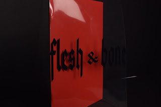
I considered and explored different ideas around the packaging of the magazine for when it is delivered to users online. 


The first idea I explored was spray painted bags. The idea behind this was to communicate the same format as the front cover of the magazine. I spray painted two bags using regular black spray paint, and surprisingly this worked fine. Problems I encountered were that once the paint dries, in the areas where it is thickest, it chipped off when bending. This means this wouldn't be suitable for deliveries and shipping due to being handled. 

Another element to this idea was adding the vinyl logo to bring out some colour. Although striking, I don't think this communicates the right tone for what I was trying to achieve. The magazine is a high end, stripped bag metal magazine, and this vinyl paired with the spray paint looks too much and may put people off. 


The second idea was a much simpler one, plain plastic sealable bags, with stickers. This looks much more professional and the glossy bag correlates with the glossy cover, resulting in an overall high quality feel, with the sticker giving the magazine a more credible effect. The stickers come in white and black, and are used to further seal the bags for shipping. 


Ceramics / Evaluation

This brief was self initiated, and intended to be a break from strictly ‘graphic design’ projects. The brief included the exploration and experimentation with ceramics, and their various methods including hand sculpting, casting moulds and using the wheel to produce different ceramic responses. The other half of the brief was a branding project, creating an identity for the ceramic whales as consumer products with relevant deliverables.

There were plenty of problems throughout the brief, the main one being that the ceramics continued to break, due to thinness around the tails and fins, and exploding clay in the kiln. However, even though a lot of the forms were unsuccessful, I managed to pick up a lot of new skills and experiences along the way, that would benefit my practice if I was to ever work with ceramics again. Working with clay was really natural and enjoyable for me, and took me outside the studio for a while. 

The branding side allowed me to visit a different aesthetic style which was suitable for the brief, and let me work in a more hands on way. 


Overall I really enjoyed working with a different discipline and combining this with graphic design - it’s definitely something I would want to expand on in the future. 

Lucy Whitehead / Evaluation

This brief entailed working cross courses with level 6 Fashion student, Lucy Whitehead. For this brief I produced Lucy’s business cards, and a preparatory  zine style publication documenting photographs of her final collection in construction. I will be working on Lucy’s final look book for the End of Year Show. 

This brief allowed me to gain experience working with a client, and a very reasonable and clear client at that, which was rewarding for me as the designer. Things ran incredibly smoothly with consistent feedback, and in the end the brief was very fast paced. This meant the resolution was created in a shorter time frame than allocated for the brief leaving me with extra time to work on other projects. 


The designs were fitting to Lucy’s practice and collection and both client and designer were happy with the outcomes. 

Creative Networks / Evaluation

For this collaborative live brief, I worked with Jack Solomon and Rhys Jones, creating an identity and promotional material for this years cycle of Creative Networks events. Collaboratively, we produced posters, flyers, vinyl signage and moving image for 3 events, Mike Mignola, Frances Morris and Simon Thorpe. 

I felt as though we all played to our strengths throughout the course of the project, splitting the responsibilities in terms of our skills, for example myself and Rhys worked on print, and Jack worked on the digital aspects, but we were not limited to this, and worked collaboratively throughout. Time management skills were very good, especially for the first event which we planned out, printed and produced the promotional materials for the event all in good time. The other events have been very close to the deadline, yet we have still managed to produce high quality responses and materials that will be used for the events.


It was very rewarding working on a live project for events within the college. Creative Networks has increased skills working collaboratively in a team, and working to a consistent concept. 

Metal Magazine / Evaluation

Demon Magazine was my personal favourite project this year, as I felt I fully immersed myself into the brief, and had a lot of passion for it from the moment the idea was born. This brief was a self directed editorial project with collaboration internally and externally within the college. It involved the production and management of a contemporary metal magazine. Collaboration included several people writing content for the magazine.

This brief increased my confidence with managing a project by myself. I always feel the most comfortable when I am in control of a project, but at times it’s important to acknowledge you can’t do everything. The main problems from the brief was putting a lot of responsibility on myself - designing, managing emails, collecting content, writing content and organising interviews to name a few. With more help, I feel the project could have been more perfect. Even just having someone else to check the file would have been beneficial, which would have avoided small mistakes within the final product. However, I feel that managing so much of the responsibility was a great way to push myself and get things done independently. 

Communication was another area that was improved upon, as a large section of the brief entailed talking to bands and collecting content. I feel like I now have more skill in handling these things for the future. 

For this brief I chose to invest in professional production services, and requested Pressision to print and bind the magazines. If I had printed this myself, the colour and professional quality would simply not have been the same. I am extremely happy with how the magazine has been produced, and it looks like a real product. I learned how to properly prepare a file for print, including setting up a spot colour.  This will prepare me for future projects where the files must be sent to an external company for printing. 


The most successful areas of this project was concept and identity, and both of those aspects working in harmony. There is a definite gap in the market for a contemporary, stripped back metal magazine differing to the existing publications available in the genre, and has become a passionate project for me which I feel I can expand upon and develop in the future. Overall I am exceptionally proud of the project as a whole and felt it was one of my strongest from the last 3 years. 

Body Modification / Evaluation

This brief was my research brief. For this project I collated information on body modification techniques and heavily modded individuals. Extreme examples were contacted via email and Instagram, for example Jenya Bolotov, Zombie Boy and Erik Sprague (The Lizardman). This information was then translated into an editorial piece of design acting as an informative encyclopedia of body modification and heavily modified individuals. 

The brief mainly allowed me to expand on my communication skills. Getting in contact with well known individuals and communicating with them on the topic of body modification was rewarding and allowed my confidence to grow. I even ended up approaching a stranger on the train. These skills can be applied to graphic design as a whole, as I believe within the industry it is always beneficial to have the skill and confidence to talk to other creatives, you never know what may come of it. 

I found collating all the information quite difficult, as I chose to try and write the whole content for the book with the help from various sources. This could have been documented with more organisation before starting the design side. 

This brief was spread out across the whole of Extended Practice due to waiting for responses and basically dragging it out. I think if I could do this brief again I would concentrate on exploring it for a shorter period of time rather than just slowly developing it over the months. The benefits of this however was that I was very involved in the design, and feel it was produced to a high standard. 

Using different stock created a dynamic resolution which I felt pushed my production skills. I’m not incredibly hands on, and find binding and printing difficult to always get right. Although not perfect, the resolution looks fairly professional for the budget. If it was professionally printed the publication could have looked even more high quality. 


Overall I feel the brief is a success. It is informative and also designed in a way that will engage an audience and stand out on a shelf. 

Ceramics / Final Belugas


The final belugas are made from jesmonite, with white pigment. This material is very hard, durable and has an attractive smooth matte finish. For this set, they were neck ties and blusher, but in the future they could wear lots of other fun accessories, such as party hats. 

Developments in the future would be an easier mold to take the belugas out, and more time to really refine their shape/smoothness. Overall they do the job for this brief and show what was intended. 

Thursday, 11 May 2017

MON REGRET / Evaluation

This project was a community based art/design project devised from a collection of submissions from users. The users submitted something they regret onto an online platform, which was then produced into a publication with relevant photography. 

This brief was a highly compelling and responsive project which was unpredictable and primarily lead by the participants. I had no control over what users could post to the online platform, meaning this was entirely up to those who posted what ended up in the publication. The uncertain nature of the project however was what made it so interesting. The project received a high amount of submissions, more than expected, and some were incredibly heartfelt and personal, that I felt grateful that someone had shared that with me. 

For this brief I explored my skills within photography. Although I don’t consider myself highly experienced or competent with camera settings, the main concern was the mood, the concept and the atmosphere the photo created, rather than any intricate technicalities, although I learned more through experimentation. The photos I created were uncomfortable, gritty and translated a handful of the user’s submissions into something visual. I felt this was the most successful aspect of the project, and allowed me to expand on my time management skills and planning ahead. To create these photos I needed some help from my friends, and supplies which I had to organise in a short space of time due to print slot deadlines and changing approaches throughout this brief. This brief allowed me to make hard decisions when I knew that the direction was not going to be as effective. 


Potential improvements could have been more time to work on photographs, but this was unavoidable due to this idea being developed later on within the brief, and getting the publication professionally printed. The publication was intended to be tabloid size, but within the digital print facility, A4 pages are the largest you can print on. Newsprint also cannot be printed on down there, so a thinner stock would have worked more appropriately with how I envisioned the final outcome. However in saying that, I am incredibly pleased how this turned out and feel it is a project that is very different to any I have done before. 

Church of Satan / Book Cover Redesign & Leaflet

Satanic Bible Redesign

Leaflet (External) 

Leaflet (internal)

One of my responsibilities within this brief was the print based materials. I redesigned the Church's bible utilising the strong identity we have created, showing consistency throughout all of the deliverables.

The current Bible design perpetuates the 'evil' stereotypes associated with the Church. The redesigned cover is clean, utilises white space and looks fresh and inviting. The leaflet also adopts this aesthetic, using the colour palette chosen. It explains the campaign in a friendly and conversational manner, in order to appeal to the broader audience who may be put off by Satanisms current aesthetic. The leaflet informs the audience about the self worship campaign, and shows it as an appealing and beneficial thing to do.

Church of Satan / Feedback Research

With our finished resolution, I used twitter polls to ask a young demographic (the predominant audience who follow me) some questions.


I attached a photo of the finished identity and asked the following questions:


Then I attached the current church branding and asked the following questions:


Although the first question could be a little misconstrued (people may just think I'm asking them if they're interested in Satanism), this feedback is incredibly successful. From the poll shown, it tells us that with the rebranded identity we have produced, more people would be inclined to explore Satanism, rather than their current branding. The poll shows that with our identity, it is more friendly and approachable which is what we set out to do.

Although the identity may not appeal to a lot of people due to the name still, I feel this is still a success for the brief, and due to testing this, we now know this has completed our aims for the project.

Penguin / Evaluation

This brief was a live project, submitted to the Penguin Random House Award. The brief involved designing a cover for the non-fiction classic, In Cold Blood by Truman Capote. 

In terms of time management, I started this brief early on in the year, and due to Context of Practice ended up abandoning it for a while until that was over. In that time however, I gained a fresh perspective on the brief and spent an adequate amount of time researching and developing my outcome. In the end this could be improved on by starting and finishing the brief in a shorter amount of time, instead of letting the project collect dust. However, the resolution was submitted within plenty of time, and I felt it was highly appropriate to the genre. 

This brief allowed me to effectively use skills I had not visited in a while, for example hand rendered textures and elements. This was refreshing and allowed me to keep up with using different techniques I do not use as frequently within my practice now.


Retrospectively, in terms of the design, I was not fully happy with the final product, as I felt it was very obvious and did not push any fresh ideas, something I strive to do within my practice. Looking at the design, it is appropriate, but does not intrigue me. In hindsight I would produce a more abstract design, with a more interesting and obscure concept.

Up Yer Sleeve / Evaluation

The Up Yer Sleeve brief was a live brief conducted by Cameron Wolfe, who aimed to exhibit a selection of submissions of redesigned record sleeves by artists who have passed away, in place of Secret 7” who did not go ahead this year. 

The brief was very short and straightforward, and much like previous years of designing for Secret 7”, involved a lot of freedom to really create whatever you wanted. Due to receiving a song by Architects who are my favourite band, there was a lot of emotions for the song which helped me create resolutions with reference to lyrics and concept. 

Skills that were utilised were concept generation, and experimental abstract resolutions that fit with my personal design style. I felt that I produced something very ‘myself’ that could possibly be detected by looking at it. 


This brief took a lot less time than originally planned out, providing a refreshing journey to a fast resolution.  

EOYS / Evaluation

This was a live collaborative brief, by myself and Charlotte Walker. The project entailed the production of an engaging identity for this year’s LCA End of Year Show, deliverables included posters, postcards, invites, e-invite & other varying collateral for promotional purposes internally and externally throughout Leeds. 

Unfortunately, the identity was not successful, however we felt that we pushed a dynamic and interesting approach to the show, displaying a sense of grandeur and showmanship that reflects us as an art college, which had not been explored previously. The resolution brought both mine and Charlotte’s design styles together effectively, creating a refreshing and new perspective to the table. 

Due to creative differences and issues with placements (I was working in Bradford at the time), myself and Charlotte chose to break from the original collaborative group and develop our preferred concept. This resulted in a fast paced process that fortunately did not hinder the quality of the design. With more time and better planning however, the concept could of been pushed or developed into a more appropriate and ‘safe’ resolution that the senior management team would have preferred. We stuck to what we thought was a fresh idea, and this mindset is integral to my own process. 


Overall, the project was in it’s own right successful, if not a little haphazard in terms of team management and planning. 

Church of Satan / Evaluation

The Church of Satan brief was a collaborative project conducted by myself and Jack Solomon. The brief was an extensive rebranding project, involving the creation of a new identity for the Church of Satan, the most public Satanic organisation originating from LaVeyan Satanism. Within this, a new campaign for the Church was also created. A variety of deliverables were produced, including a new identity (logo, icon), website, campaign video, t-shirt, bible redesign & campaign leaflet. In terms of responsibility, myself and Jack split the deliverables between our skills. Jack is digital based and enjoys working with those aspects, therefore he worked on the website. He also concerned himself with the posters. I am more print based, therefore I worked on the Bible redesign and leaflet. Due to a recent passion for video, I also edited the promotional video for the campaign. 
Creating the video increased my skill and competence within After Effects software and using video footage shot by myself and Jack. We asked two participants to speak about “Self Worship”, therefore the footage was our own, and came about organically. The project also resulted in my skills evolving within branding, and creating a resolution that was conceptually sound rather than just focusing entirely on stylistic areas. It was enjoyable to apply our identity to new deliverables, such as t-shirts, and see it come to life from paper. 

I felt this brief furthered my collaborative skills and time management, due to working with someone who has a great work ethic. This was rewarding to see the brief develop through hard work and perseverance, and through pushing ourselves to produce something professional and of a high standard. Professionally was an aspect we both felt strongly about, as the resolution would be for a large organisation. Considering the context and audience was also important to our final resolutions, developing aims for the project helped to direct us into a successful design which solved the brief. 

Problems included working within a short space of time on the video, and making use of the facilities that we could. During the filming process, students taking photos in the studio next to us were extremely loud, which disrupted our footage and also can be heard in the video. This could have been solved by using a soundproof room, or having a higher budget to produce a higher quality video. The backdrop also contained a large stain which could not be removed on the day of filming, but using intuition and a bit of editing, this problem was minimised. 


The most successful aspect of the brief was our time management, and our logo. The logo effectively resolves the brief by providing a new, current and inviting identity to the Church of Satan, which would attract a broader audience according to feedback. It was felt that all our deliverables for the brief were produced professionally and to a great quality. Overall it was an excellent project to work on, and did not pose any large problems throughout, successfully immersing me in new skills and approaches.

Church of Satan / Tshirts

The logo was printed onto t-shirts, displaying ways the logo can be applied to various deliverables and merchandise for members.


Church of Satan / The Self Worship Campaign

The Self Worship campaign communicates the ideology that you are your own God - a notion that originates from LaVeyan atheistic Satanism. Satan is a symbol that encompasses what the religion stands for:

"The only "god" in LaVeyan Satanism is the Satanist himself. Satanism is a celebration of the self. It encourages people to seek their own truths, indulge in desires without fear of societal taboos, and perfect the self." source 

The campaign aims to promote positivity through the act of worshipping oneself. This acts as the umbrella term for methods of feeling powerful and loved by yourself; i.e self love, self confidence, self respect. The campaign displays the Satanist wearing a crown, which is the updated Church of Satan logo. The crown representing self importance, that you are the one in charge. 

This campaign is successful in comparison to the Church's current identity and approach, as it promotes the act of self worship as an attractive trait which benefits the individual, and does not scare them away with too much emphasis on the word Satan, or any 'evil' aesthetics. 

Church of Satan / Initial Ideas / Logo


To begin, we needed to establish a solid new identity for the Church. We began by generating concepts around the religion as a whole. During research we really delved into what the church was about, and the consensus is that the individual looks out for themselves. There is no God, but you worship yourself. This lead onto using a crown within the logo. The crown represents royalty, importance and egocentrism. For Satanists, you are the most important person. 

These sketches were then narrowed down and refined, and finally adequate for digital development. 


Church of Satan / Initial Ideas / Campaign


The Church’s website in its current state, is very unwelcoming and isolating. We needed to generate a way to engage a wider audience. Through sketching and discussion, we came up with a campaign stemming from the basis of the logo, named the Self Worship campaign, depicting the member wearing the crown logo on their heads. This represents the religion, by using the official logo, and also represents self worship and importance in the self.

The second idea we came up with was titled “Changing Perceptions”. From research, we gathered that the attitudes towards Satanism are predominantly negative, and many believe the Church is evil. If anyone was to read into the truths of the Church, it would become clear that this is not the case. These posters contain vital scriptures from the Church, shown in a friendly and inviting design composition. 

We felt the Self Worship campaign was  more effective and could be pushed further using photography and video in the developments. 


Body Modification / Final Product

The final product is a limited edition publication celebrating and exploring techniques and individuals within the world of body modification, with particular attention on the West. 

The book utilises different stocks and treatments such as red inserts and acetate dust cover with engaging type treatment, providing an interesting and fresh outlook on the world of body modifications within editorial design. 


The content is collated from various sources, but it is how this information has been translated into a design resolution that makes it stand out and be successful. 


Wednesday, 10 May 2017

Up Yer Sleeve / Final Sleeve


The final resolution reflects the idea of losing faith and abandoning it, as depicted through the broken cross. Through research into Architects album artwork and songs, the concept of “broken cross” was also applied, a song from Lost Forever Lost Together. Architect’s overall stance is quite atheistic and serious, so this concept works well with their discography and looks effective

and striking. 

Up Yer Sleeve / Developments

For development two concepts from the initial ideas/lyrics were explored, since this brief is relatively short and sweet, it is good to expand on both avenues as much as possible to determine the correct and most effective resolution.  


“DISINTEGRATE”

Development began by exploring visual concepts of disintegration, i.e dust, fading. The lyric was distorted to also reflect the word. The feeling overall is one of loss, desperation and as though things are dissolving infront of you. 


“GOD KNOWS I LOST ALL MY FAITH”

This second concept was also developed. This lyric was very poignant, and reflects the feeling of losing one’s faith when something terrible happens, of course, this was related to Tom’s struggle with his illness, and the feeling of losing his faith in God. The idea was to communicate the symbol of God being broken, and lost, and also combining this with the same ‘disintegrating’ effect. 

The use of the colour purple refers to God himself, as this is regarded as a holy colour as found within research. It is the colour of trust and faith, and shown here it is becoming taken over by black, and broken up by the darkness.

Up Yer Sleeve / Initial Ideas


Initial ideas began by taking the research into the lyrics of the song, and applying them to potential concepts. A mindmap helps to visualise your thoughts and organise them into possibilities which can be developed. 

The idea of communicating sickness through the design was firstly appealing due to the raw emotions within the song, but I personally felt uncomfortable with this as Tom’s death was very upsetting, and it was felt that it shouldn’t be the focal point of the design. 

The song communicates a sense of nothingness, which could be explored through darkness, block colour or space.

The ideas that really stood out were ‘disintegration’ and ‘losing faith’, as it was felt that these could really be explored and communicated through abstract ideas and concepts to form a unique and impactful design that not only reflects Gone With The Wind but Architects as a band. 

Up Yer Sleeve / Research

The song allocated to me was Architects - Gone With The Wind. Architects are my favourite band, and unfortunately in Summer 2016, Tom Searle, the guitarist, passed away due to a 3 year battle with skin cancer. 

Gone With the Wind is a song that tells of a struggle with hope, faith and the thought of passing on. Tom was the main songwriter for Architects, and many of the lyrics are political, and also personal to his own struggle over the past several years. The lyrics therefore are personal, and show a lot of emotion. The song almost describes the feeling of losing hope and giving up, going with the wind. 


Research began with analysing the lyrics within the song, to pull out potential concepts. The song is rife with thought provoking lyrics.

“Disintegrate, annihiliate me”
“God knows I lost all my faith”
“I’ll get the hell that I deserve”
“A sickness with no remedy” 

“Hope is a prison” 


Gone With the Wind is from the album All Our Gods Have Abandoned Us. Research was conducted into the album artwork for this record, which shows an ellipsis with smudged black shadows around it. This was interpreted as darkness, covered up by the light. Architect’s other artworks were also researched to form an overall feel for how their artwork reflects the music. There is lots of dark tones and distressed treatment, something which should be  communicated within the resolution.