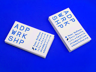
I began to gather research on existing business cards which I felt had a similar vibe to what I would expect to be creating for Lucy. The initial thoughts I had was a minimalistic composition, keeping the attention onto the information and initials and not too much concern into extra details. Lucy's work, especially the recent collection, concerns itself with block colour, so this was another consideration. I thought about printing onto coloured stock to achieve a seamless colour. Examples of this include the Cumquat and almost Modern's cards.
Next was typeface choices. The options here are quite open, with her work being quite contemporary and forward thinking, a sans serif may be relevant but looking at the labels Lucy sent me, there is a serif font in use, which would suggest that this will be a good move to keep it consistent. This design will also be used as the swing tags in her designs, so it needs to avoid looking out of place.
Experimenting with the alignment of the information will also provide interesting compositions that will bring a simplistic layout to life, for example the ADP WRKSHP cards below.
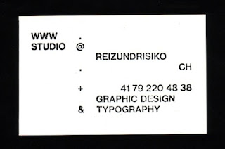
They should capture the modern style of these examples below, but also consider how this can be pushed using shape, colour and type.


No comments:
Post a Comment