Sunday 30 April 2017

Ceramics / Studio Arhoj

Studio Arhoj has been a favourite of mine from the start of the year, specialising in unique ceramics through different materials and techniques, I visited their website to find out what they're all about.


"The Studio


Located by the harbour in Copenhagen, Studio Arhoj is a Danish interior & design studio run by Anders Arhoj. Originally founded in Tokyo in 2006, Studio Arhoj is now based in Denmark.
In addition to exploring the visual relationship between Scandinavian simplicity and traditional Japanese culture we are interested in keeping alive traditions and knowledge about old crafts such as wheel throwing and glaze construction.

The Design


We design and produce new items on a regular basis - with the ambition to present something new around spring and fall every year.
Our products are developed on both paper and on the potters wheel. Materials used in production include wood, clay, porcelain, paper and glass.
Our main focus is form as opposed to function. This doesn't mean you can't use our items in your everyday life, it just means we're really focused and interested in creating beautiful, fun objects.

The Process

Experimenting is a deeply integrated part of our daily production. We dedicate a lot of time to discovering and testing the seemingly endless possibilities of glaze and clay. Failure is something we know well, however, when something works the reward is worth the struggle.

Many of our items are hand-thrown by skilled potters on the throwing wheel in different kinds of clay. Our porcelain items are cast in plaster molds by skilled artisans." source


Some of my favourites...


Studio Arhoj are well known for their ghost ceramics, which are sold in other outlets such as Colours May Vary. 


They also deal with everyday items such as mugs, bowls and cups, but what sets these aside is their unique treatments and colours/glazing. They are mesmerizing and each one hand crafted, making them special and personal.

The cute nature of a lot of their products draws me in personally, and is something I want to capture in my ceramics and branding.

Swamp thing. This one is my favourite on their website, I wish I could take him home myself but sadly he is sold out (and very expensive). Once they're gone they're gone!

Looking further into Studio Arhoj gave me an insight to how a contemporary ceramic studio works, and how everything is hand crafted through various methods and techniques. 

Ceramics / Final Branding

Icon


Logotype


Full Logo


Bag


Website


All these collateral resolutions followed the same guidelines such as colour/style/hand rendered type, to show continuity across the whole range. Soft colours such as pastel pink and lilac/blue are used to set a calming and soft tone throughout. The lowercase type further pushes this and creates a friendly and relaxed tone of voice. Colloquial and informal discourse is used throughout the Belooga brand to also create a specific informal tone of voice. Sketches are used throughout, combining realistic elements such as proportion and shading, but incorporating more unrealistic and abstract shapes such as party hats and blusher, using just lines. This communicates the character within the brand and it's unique qualities.

Creative Networks / Future Events


It can be seen above how we appropriately use colour and change the positioning of the rectangle to suit the imagery. It would not make sense to obstruct important parts of the photograph. This demonstrates how versitile our composition and solid identity was, as shown on our resolutions for the next Creative Networks events for 2017. 

Ceramics / Product Range & Distribution


Product 
The Product is a fully branded set of ceramic beluga whales. They will be made out of stoneware clay and each hand crafted. The idea of selling bespoke ceramic is definitely more appealing to myself and others because of it's personal quality which corresponds with the branding for the project. 

Range
There are two characters, Lasagne and Spaghetti, who each have their own personality and appearance unique to that beluga. They wear party hats and appear to have blusher on which gives the project its own individual identity. The branding entails logo, used on a variety of collateral e.g tags, website, bag, and advertising. The branding adopts a hand rendered feel just like the belugas themselves. The name of the brand is 'The Beloogas', and in full, 'The Beloogas: ceramics by Lo'. Putting the creator in the name makes it even more personal and special, for example Lush - they attach a sticker that says who made your soap at what time. 

Distribution

The belugas will be sold in the shop/studio, and will be available online globally. One shop makes them feel more special than having them sold in chains and various outlet stores, but this could be debated later down the line if their popularity grew. 
Online, the belugas can be bought and information on them such as character profiles and the Belooga Trust is available. The online aspect allows easy access from any location. The Beloogas are intended to be a bespoke and niche product not suitable for mass production, and part of their USP is that they are unique and one of a kind. 

Live Brief / Pink Magazine / Guidelines

We formulated some basic guidelines to keep our magazine consistent throughout as we were working separately on spreads, which will come together when finished into one publication. This included typefaces, weights, colours and logo/badges.


Saturday 29 April 2017

Metal Magazine / Samples

To make sure the final printed copies will look how I want, I requested two samples of 90 GSM stock in gloss and without to see which works best.


When I recieved the samples I was very pleased with the gloss stock, it felt authentic to how a magazine usually feels. However unfortunately the pink had printed in a very light baby pink which was not what I was aiming for. I had approached Pressision because of their abilities to print bright fluorescent pink, and this shade could possibly be achieved if printed in the print room. 


I emailed Shelley to ask why the shade had printed like this. 


The print samples will be redone with more hits to achieve a more fluorescent pink. 

Live Brief / Pink Magazine / Evaluation

Pink Magazine was another brief which allowed me to work with another member of the class whom I am very comfortable with and feel I can work with efficiently. Both I and Charlotte have previously worked together without any problems and I felt in this instance it was exactly the same. We managed our time and responsibility well, by splitting the content between us. This was good experience in terms of setting guidelines and both sticking to them.

Time constraints were only an issue due to the client. Charlotte and I feel as though the project ran smoothly on our end when we had the relevant content to work with and was not waiting on receiving more of it. In all honesty, it appeared that there was  poor team management on the clients end, and unavoidable circumstances which did push back the completion of the brief. Communicating with the client was extremely important for this brief, as we needed to know when content would arrive for us. I feel as though this is an aspect I have improved upon through this brief.

The project was enjoyable to produce, but on reflection it is debatable that the design choices for this brief were easily communicated. The logo aimed to reflect that the publication challenged current stereotypes and existing teen publications, and we felt a more masculine colour could be a cliche. We could not avoid this as it was the client who created the content and wanted pink to be the dominant colour.

Live Brief / Pink Magazine / Final Product

Although Georgie would not have the images ready for the deadline due to unfortunate circumstances, we added placeholder images to add context to the final product and ensure it did not look empty for our own submission. We chose images that we felt were appropriate for the magazine and would be similar to what Georgie would include herself, using fresh feminine imagery that was not alienating or too stereotypical.

The publication was sent off to Georgie and clearly labelled where her images can go when she has them ready. Both I and Charlotte sent out invoices and were paid promptly, allowing us to sign off on this project.


Lucy Whitehead / Business Cards / Final


Final business cards are solid dusty pink, with contrasting white info and chain detailing. L.W will be foiled to separate and add extra depth to the business card. Standard size, landscape. Client was happy with the design and files were sent off and therefore it has been signed off as a complete brief.

Lucy Whitehead / Business Cards / Development


Beginning with a very simple and fast version of the chain to get a feel for the idea before refinement. Utilising pantone colours supplied to me from Lucy. All of these colours together are complimentary and also match the collection, but also can be easily changed in the future. 


Sketched out version of chains, looks more personal and relaxed as the last version was more rigid and flat. 


Expansion of chains, and also trying out a landscape version. Chains separate initials and create balance. White background adds breathing space and creates contrast. 


'Menswear designer' taking full focus in a different hierarchy. Experimenting with outlined type at a much larger size as to bring more attention to the designer rather than the chain detail. These take a back seat. 


After a few comments from peers, it was suggested that the chains could 'frame' the cards, to match the layout of the information on previous developments. I liked this idea but felt it did not communicate as well when it was done, and looked a bit too decorative and 'frilly'.


Feedback 


Further Developments 

Now that foiling has been discussed, I felt this was a good route for the design as it will separate the chain and type further. Lucy liked the idea of the chain and so I felt I should develop this more as currently it is quite imperfect and sketchy. I felt a smoother more refined chain could be an improvement. 

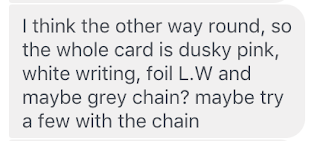
I also asked about colour choices:


So the next step was refining the chain and experimenting with different colour combinations. It was great to have hit the nail on the head with the concept this early on in the project. 


Feedback


Final developments

Using dusky pink as requested, with white chain and 'silver foil'. 


Lucy liked the design which was really rewarding as it was definitely an enjoyable process and was not long winded. 


Lucy Whitehead / Business Cards / Initial Ideas


I began a sketching a few very simple ideas to put ideas onto paper in preparation for development. I felt as though I would not be creating a full new logo for Lucy, rather just experimenting with initials, there was not as much need to really sketch out many compositions. Because of time constraints, I also wanted to get the brief moving fast and efficiently. 

Concept

Utilise a minimal layout in terms of information, and push personality through the use of metal chains. These represent Lucy's creative work, and also connote the connections made through the industry through networking and distributing business cards.


Feedback

I contacted Lucy about this idea and showed her some initial sketches. Although she initially only thought about having her initials on the card, she showed an interest in seeing this idea developed and gave me the go ahead in creating it and moving forward. 


Lucy Whitehead / Business Cards / Research

I began to gather research on existing business cards which I felt had a similar vibe to what I would expect to be creating for Lucy. The initial thoughts I had was a minimalistic composition, keeping the attention onto the information and initials and not too much concern into extra details. Lucy's work, especially the recent collection, concerns itself with block colour, so this was another consideration. I thought about printing onto coloured stock to achieve a seamless colour. Examples of this include the Cumquat and almost Modern's cards. 

Next was typeface choices. The options here are quite open, with her work being quite contemporary and forward thinking, a sans serif may be relevant but looking at the labels Lucy sent me, there is a serif font in use, which would suggest that this will be a good move to keep it consistent. This design will also be used as the swing tags in her designs, so it needs to avoid looking out of place.

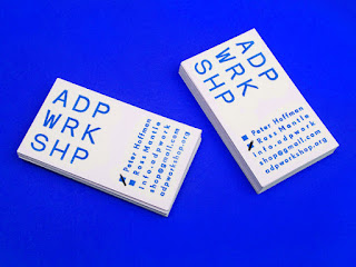
Experimenting with the alignment of the information will also provide interesting compositions that will bring a simplistic layout to life, for example the ADP WRKSHP cards below. 

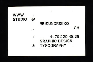
They should capture the modern style of these examples below, but also consider how this can be pushed using shape, colour and type.