I had not much prior experience to drawing death metal logos, so I knew this would take some practice and inspiration. I watched a number of youtube videos and took inspiration from the methods in which they tended to draw their logos. I also looked at some existing band logos for guidance.
One video I found particularly useful was by Glorious Gorification who has made drawing death metal logos into a career move, earning money and gaining comissions from bands and clients. His video on youtube shows how he starts off by drawing a 'rough' grey shape of the type, then going in with black details. This was a method I wanted to try rather than hand drawing as it was more convenient to have the design on the laptop from the word go.


So I began getting back used to my tablet and tried drawing some logos out (with the previous name I was going to use for the magazine initially).


The first stages were shakey (and a little embarrassing but I guess that's what we call development...) The vibes I got from this design was 'Nightmare before Christmas'. So it's a bit too soft goth. The ideal element of symmetry is also not apparent in this design. I decided to start again and use type as a guide in the background, such as an Iron Maiden-esque blackletter.


These turned out a lot more clean and uniform than the first attempt, and the details were improving. Areas to improve on next was even more symmetry and larger drawn forms, trying not to worry to much about legibility. The letters here are too thick and don't communicate the type of death metal logo I was trying to create. I wanted it to look spindly, creepy but also of a good quality.

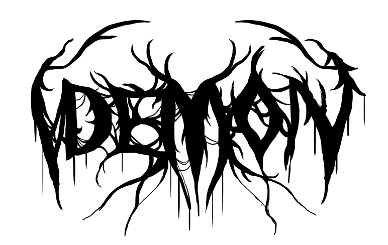
Again, another improvement (and name change). The symmetrical 'branches' give the logo more shape and make it look dynamic and 'over grown'. The D and the N should try and be as similar as possible to round off the logo. This is a prevalent feature of existing metal logos. The forms however still lacked a certain quality and orderliness. Even though the nature of these logos is to be 'messy', I quickly discovered there's a certain art and organised chaos to the production of death metal logos. For example here the M is not symmetrical and looks disorganised.


For this development I really focused on making the letterforms neat and symmetrical from the start and concerned myself with the overall structure, not letting myself add detail until I was happy with how it looked in the simple form. I used a very destroyed blackletter for a guide. Above is the final logo drawn out before more treatment.

Here I experimented with outlines and colour. Overall the outlined version looks even more intricate which gives it more appeal as it was an aim to create a logo in the death metal style, not concerning too much with legibility and focusing on making it more of a logo and a symbol.
No comments:
Post a Comment