Friday 31 March 2017

EOYS / Final Outcome and Collateral


Above are our final outcomes, demonstrating how our identity can be implemented on various promo material for the event. 

Metal Magazine / Local Bands / Interview

I asked Total War to answer a few questions for a small feature within the local upcoming bands section of my magazine, which they were happy to do.


Where are you guys from?
3/4 of us are from Bradford, so we class as a Bradford based band. Even tho Bradford has literally no Hardcore scene, so whenever we play live shows its always elsewhere. 


How long has Total War been going?
We have been a band for about a year and a half now, but we only really started playing shows and doing practices till summer last year, which is when we played our first show at the Parish with Guilt Trip.


What are your influences? 
If i am been honest, none of us really have infulences which give us our sound. We all have the bands we listen to, but when we are in the process of writing songs, we try be as diverse as possible.


What are your plans for the future?
Our short term goals are to keep playing as many shows as we can, and have our second release, released next year, and after that, we are hoping to do a UK tour and try grow as much as we can.

Thursday 30 March 2017

Metal Magazines / Limitations

Chosen Colour Palette

Since I have chosen to use a bright pink, which stylistically and conceptually makes sense and works well, it has limited me due to it being difficult to achieve this colour without either paying a lot of money for litho printing or Pressision to print, or looking more on the 'zine' side and printing by risoprint. Since the aim of the publication is to look professional, I would have to research and look at samples of both to firmly decide which is worth it. 

External Content 

To create a successful magazine, there needs to be content from other sources, i.e writers, reviewers, photography. I wanted to try and involve a lot of people who are interested in the topic and would feel confident writing. Unfortunately, this lead to a lot of limitations such as articles not being sent, or not being sent on time, which is obviously out of control sometimes, limiting me on how much I can include in the publication, and slowing down the process a lot. However, on a positive note, this also lead to a lot of great content I've been able to include in the magazine.

Time 

I aimed to create something I'm extremely proud of, and so I knew this brief would probably take the longest out of most of the ones I have been planning. I'm obviously not a magazine manager but I've had to try and adopt that role to the best I can to produce something high quality, functioning and a resolution to the problem I have addressed within the brief.

Ceramics / Branding / Final Logos & Assets

About the type

Hand rendered type created by a very small paint brush and black indian ink. Scanned in and set out. Thin forms and spontaneous line heights give a quirky feel which is pinnacle to the brand and style of the ceramics. Aims to look child like and preserve innocence.


Final logo which will be used on all collateral. 


Headers for use on digital platform. Keeps continuity within the branding and adds personal touch.


Tells what the brand is, and who by. Again creates a personal atmosphere, as though it's signed by the artist. Would also be used on tags and digital platform.


Names of the Belugas, again keeps it personal, and gives the actual ceramic pieces a personality in a name. These can be used on the tags to label which beluga is which. 


Ceramics / Beluga Moulds

Now I've experimented with clay and felt as though I was developing the skill of creating the belugas by freehand moulding, I wanted to experiment with more materials the belugas can be made from. From previous experience I know that vinamold is a cheaper alternative to silicone but less materials can be poured into it. Silicone can host a variety of different materials, from resin to jesmonite. This seemed the most versatile component to make the mould from as then I could experiment with a wider amount of materials and not be limited.

The technique which was advised which was to make a silicone 'jacket' rather than a full mould, cutting the cost.

I created two more belugas, again which were an improvement on my last, and then poured silicone onto each whale, which created a thin layer. This dried overnight and then a 'thixotropic' was applied to a mix of silicone, and 'iced' over them again, to create a thicker surface mould. This again took hours to dry.

Then was the plaster. Creating two 'walls' of plaster forms a hard cover for the molds when materials are poured inside. The plaster is pulled apart when dry, and fastened back together with rubber bands with the silicone mold inside when in use.

This method has been quite long winded in comparison to hand making the belugas, however this would be more cost efficient in terms of distribution if this was to become a proper business as the molds can recreate the same shape multiple times with a large amount of materials.


I filled the finished mold with wax and Jesmonite but both of these ended up with the belugas having broken tails. My options are to try again and be extra careful when taking them out from their molds, or to just hand mold them again and glaze the final products. 


Body Modifications / Sources

Sources used throughout research and data collection:

[Irezumi | Knickerbocker Mfg. Co.](https://knickerbockermfg.co/blogs/thenews/36920065-irezumi)
http://www.powerverbs.com/tattooyou/history.htm
[北京纹身热刺青 - 北京纹身热刺青的微博](http://www.x-weibo.net/u/5762664810/p_2.html)
[Body suspension: why would anyone hang from hooks for fun? | Life and style | The Guardian](https://www.theguardian.com/lifeandstyle/2013/nov/10/body-suspension-hang-from-hooks-fun)
[International Suspension Alliance – ISA](http://suspension.org/)
http://www.skin-artists.com/body-suspension.htm
[Extreme Body Modification - Tattoos, Implants, Piercing](http://www.refinery29.com/body-modification-portraits)
https://www.instagram.com/jardelrfotografia/?hl=en
Guy Le Tatooer
“UNTITLED. SERIE MARAS, 2006”.
http://www.exposureguide.com/culture/algerian-women-portraits-of-women-captured-during-the-1960s/

Thursday 23 March 2017

Body Modification / Production / Stock

For the publication I wanted to have a section of 'profiles' for individuals who are heavily modified/well known for their body mods. i.e Zombie Boy. I wanted this to be separate from the rest of the research in the publication. I thought about the colour scheme, and thought it would stand out if these pages were red. Instead of printing red ink onto the pages, red stock would have a more professional finish, and be easy to print on alongside the plain white stock for the rest of the booklet. Due to experience with printing ink as the background on publication spreads, I have found that this tends to crack especially when folded.

As for the cover, I wanted there to be many layers before opening to the content. To achieve this, the publication will have a protective dust jacket with the title printed on, and under this will be the same red stock in the middle of the book, to again increase professionality and consistency. The red relates to the title of the publication, 'flesh and bone', as red is a colour commonly associated with the inside of the body. White stock represents the bone, red represents the flesh.

Sunday 19 March 2017

Live Brief / Pink Magazine / Initial Spread

Working with a grid and a baseline to keep the publication organised, we agreed on a basic guideline for the magazine after creating the Masthead. We agreed on a colour palette and the choice of typeface is Univers Black, a bold font to demonstrate the vibrant and bold nature of the magazine. We wanted to create something contemporary to communicate how this magazine challenges others in the market, but not too contemporary that it alienates the audience. It needs to look aesthetically neat, pleasing with a slight edge.

Following receiving content from Georgie, we split the spreads into two to keep a good time management.

My spreads:


Charlottes spreads:


We then sent these to Georgie for a follow up on feedback and if we're heading in the right direction. 

Live Brief / Pink Magazine / Style

After discussing the brief, Georgie provided an email with information such as tone of voice and stylistic inspiration. She also said that she was keen on the personal branding I had done last year, so this was a good place to start.
"Pink is a brand new magazine created with young adults in mind. The content currently available on the magazine market does not directly reflect their needs, and we wanted to change this! Pink will contain articles about the LGBTQ+ community, safe sex and relationships, politics and world issues, as well as more traditional topics like fashion and beauty. It is an entirely student led publication, run out of their own pockets and with the help of talented contributors.
The name Pink stems from an ironic take on what is traditionally something for women, and the connotations surrounding who ‘women should be’. Pink will challenge these stereotypes. This will be the first issue of the magazine, and hopefully the first of many. Our target market is young people aged 15-22. We feel this is a real developmental age in young people, as they make the transition from child to adult. Pink aims to assist them in their journey.
As this is a brand new publication, official branding and colour schemes have not yet been set. We think this is exciting, as it gives graphic designers full creative control (in accordance with a few guidelines). We are currently open to ideas, so would love to discuss colour charts etc with you in more detail. We are leaning towards more pale, pastel colours- avoiding harsh reds and dark blues. The images and photographs used will be very vibrant so we do not want them to clash. We particularly like pinks.

The magazine will be very visual in its content- with large, glossy photographs adorning many of the pages. It is important any designs accommodate this. The magazine will be more like a zine in its design- several artists and poets will contribute and receive full page spreads for work etc.
The magazine, ideally, will look arty yet accessible. We want it to stand out from other magazines, but also don’t want to intimidate potential readers. We’re thinking bold design statements, as we believe the magazine should be as much about its design as the content itself. It’s not a lot to go on, but let your creativity too wild. There is no design style we will not consider. We have looked to the following publications for inspiration:"


Live Brief / Pink Magazine / Brief

A media student named Georgie McGowan needed designers to help produce a magazine for her final project. Charlotte contacted her to find out more and whether we could possibly work on this as a team:


Working with external content, we would aim to create a magazine targetting young adults, providing a new perspective on women's publications. Georgie did not have a clear guideline for the brief, so this offers us to have creative reign as long as it is appropriate. Since me and Charlotte have had prior experience in creating zines, we thought we would work well on this project together and combine both of our skill sets.

This will need to be completed in time with Georgie's deadline, and will depend on when the content is provided. 

Thursday 16 March 2017

Metal Magazine / Counterparts & Code Orange


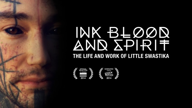
Every genre of metal/hardcore/rock has it's own style, as with everything, it becomes its own subculture. Such as Blink-182 and the pop punk style, Korn and the nu-metal style that came with that band, and throughout time more and more aesthetics develop and evolve with the genres. Pop punk now looks a lot different than it used to, because of social changes. This goes with any genre, even some becoming more obsolete. Nu-metal was big in the 80s-90s, but now doesn't have such a large following as it once did with bands such as Korn, Deftones, Incubus and Limp Bizkit paving the way. 

This magazine includes all genres of heavy bands, but takes it's own stance on the aesthetic it will take forward. A main source of inspiration is the bands Counterparts and Code Orange, because of their album art/merch style choices. Being a heavy band such as those, some may expect a very harsh and rustic style as you may see with a band such as Trapped Under Ice or Converge, however, these bands I have noticed have rethought this and modernised the hardcore aesthetic through image and typeface choice, bringing a contemporary feel to the band.


In Code Orange's records Forever and I Am King, the use of a sans serif (likely to be helvetica), positioned over the top of the image is a popular trend in hardcore music/merch/artwork, as seen on other bands such as Weekend Nachos (which literally looks the same as this). The disturbing gory imagery brings the context right back alongside the vivid colours of the typeface, connoting volumn through colour and capitalisation. 

Counterparts use a series of aesthetically beautiful images for their album The Difference Between Hell and Home, which again contrasts with the style of music they produce. I like how covers such as this can look unassuming instead of stereotypical, with soft colours and settings.

Another record which in particularly inspires me is Thy Art is Murder's Holy War artwork:


The reason for this is the contemporary, professional looking photography combined with the dynamic logotype for their band. This juxtaposition between clean composition and chaotic elements is something that I feel could really work with the publication, to set the scene but not succumb fully to already existing stylistic choices in metal publications, and put a unique stance on it. 


Body Modification / Documentaries

A good source of inspiration and resources was documentaries surrounding body modification. This included Needles and Pins, a Viceland documentary presented by Grace Neutral, and  Ink, Blood and Spirit by Little Swastika.


These documentaries depicted real life individuals telling their stories on modifications. Both of these documentaries also adopt an engaging and seamless aesthetic which influenced the concept and aesthetic of the publication. 

Tuesday 14 March 2017

Ceramics / Developments

During this session, I aimed to learn two new techniques in creating the whale shape, and also maintaining a smooth texture. Although I want the belugas to have character, a level of quality and professionalism must be sustained.

The two techniques were very useful in teaching me how to create smoother shapes.

The first included rolling out a section of clay using a rolling pin and two sticks, and then laying this rolled out clay over the top of newspaper, moulded into the desired shape. Then you cut around this, and have half of the 'body'. They must then be connected by making small crosses on the sides and using a mixture of clay and water to stick the two together. This can be reformed to create a smoother form.


The second technique included making balls out of the clay which were then made hollow by shaping, and formed together in a similar way to the first technique.

The first was more useful as I just needed to roughly shape the newspaper into the shape I wanted and went from there, however, free forming the shapes by just modelling is my preferred method.

During the session I also learned techniques to make models smoother by using the pottery equipment which definitely helped my next batch of belugas. These belugas will be simply fired and remain matte instead of glazing, to see how this looks in comparison.


Above I made a smoother beluga similar to the first one, a fat sitting beluga and a (badly done) beluga head.


After the firing process they looked like this:


They are much smoother and look more squishy which is something I'd like to achieve.  I'd like to redo the sitting beluga as he is a bit crispy and not smooth on the tail. This was due to the clay becoming a bit dry over the day. The next developments will explore more techniques within ceramics to see if I can add colour or a different glazing method. I also feel comfortable enough to begin production of the branding section of this brief.

Monday 13 March 2017

Metal Magazine / Pressision Samples

Since a limitation will be the choice of colour, I needed to assess the options around getting the publication printed outside of university, due to limitations with printing inks. At Pressision I had heard they are able to achieve fluorescent inks, so emailed to discuss pricing and if they are able to print a colour I need. I sent a few spreads for reference.

Following on from this, I was sent samples in the post of the fluro ink available for printing at Pressision.


As can be seen above there are obviously different shades of pink ink, printed over the top of white ink to open up the option of printing this on darker stocks. For what I will be needing it for is mainly fluorescent duotone image.

This seems like a great option for the production of the magazine, however, costing will be the main limitation for this. Being a student, it is very likely I won't have the disposible income to print with Presission, depending on the price, since it is A4 and has around 70-100 pages.

Metal Magazine / SNEEZE


I found out about SNEEZE magazine when talking about my metal magazine plans with Chris, a freelancer at Everyday Something, when completing my internship. He suggested I take a look at it because of its fresh photography, style and context. 


"SNEEZE looks to expand the street-inspired culture of skateboarding to unexpected references, people, places, and images. Unpretentious and honest, SNEEZE is a broadsheet paper trail of intrigue."


SNEEZE immediately showcases a contemporary and unapologetic style, using modern images mainly focused around Skateboarding. SNEEZE is a great example of a magazine which aims to do what this brief entails, creating new boundaries for skateboarding; claiming it aims to expand the street-style culture involved with skateboarding this suggests that Sneeze is more inclusive to the unexpected. 

This type of inclusion is something that needs to be emulated within my own project, showing that not just burley men are the ones who enjoy metal, expanding the expectations of metal music, socially, and rethinking how the common 'metalhead' has to look.

Aesthetically, SNEEZE combines a luxury feel with it's use of aesthetically pleasing and contemporary imagery, with it's street inspiration by a quick and easy binding method. It is a broadsheet, when unfolded reveals a poster inside which can be used on fan's walls and provides an extra use than just a magazine. It's something to think about when deciding on binding methods for the magazine I will produce. 

As seen above, what draws me in particular is the use of narrow columns which gives the publication a structured feel in between the imagery, an aspect which will be included in my own work. Narrow columns in particular make the information seem important, as it would on the front of a newspaper.


The magazine also contains a fair amount of nudity. Is this to feed the male gaze or to empower women? 

Wednesday 8 March 2017

Metal Magazine / Creating the Logo

I had not much prior experience to drawing death metal logos, so I knew this would take some practice and inspiration. I watched a number of youtube videos and took inspiration from the methods in which they tended to draw their logos. I also looked at some existing band logos for guidance. 

One video I found particularly useful was by Glorious Gorification who has made drawing death metal logos into a career move, earning money and gaining comissions from bands and clients. His video on youtube shows how he starts off by drawing a 'rough' grey shape of the type, then going in with black details. This was a method I wanted to try rather than hand drawing as it was more convenient to have the design on the laptop from the word go. 


So I began getting back used to my tablet and tried drawing some logos out (with the previous name I was going to use for the magazine initially). 


The first stages were shakey (and a little embarrassing but I guess that's what we call development...) The vibes I got from this design was 'Nightmare before Christmas'. So it's a bit too soft goth. The ideal element of symmetry is also not apparent in this design. I decided to start again and use type as a guide in the background, such as an Iron Maiden-esque blackletter. 


These turned out a lot more clean and uniform than the first attempt, and the details were improving. Areas to improve on next was even more symmetry and larger drawn forms, trying not to worry to much about legibility. The letters here are too thick and don't communicate the type of death metal logo I was trying to create. I wanted it to look spindly, creepy but also of a good quality. 


Again, another improvement (and name change). The symmetrical 'branches' give the logo more shape and make it look dynamic and 'over grown'. The D and the N should try and be as similar as possible to round off the logo. This is a prevalent feature of existing metal logos.  The forms however still lacked a certain quality and orderliness. Even though the nature of these logos is to be 'messy', I quickly discovered there's a certain art and organised chaos to the production of death metal logos. For example here the M is not symmetrical and looks disorganised. 


For this development I really focused on making the letterforms neat and symmetrical from the start and concerned myself with the overall structure, not letting myself add detail until I was happy with how it looked in the simple form. I used a very destroyed blackletter for a guide. Above is the final logo drawn out before more treatment.


Here I experimented with outlines and colour. Overall the outlined version looks even more intricate which gives it more appeal as it was an aim to create a logo in the death metal style, not concerning too much with legibility and focusing on making it more of a logo and a symbol.