Tuesday, 31 January 2017

Ceramics / Rowena Brown


Rowena Brown's ceramic pieces tend to adopt a 'weathered' look, through cracks, stains and chippings. Her house pieces are what interested me in her work, because of their abstract shape which reminds me of a traditional egyptian house with small windows and an open door.

Brown's range of house pieces stood out to me because of the intriguing technique called 'raku firing'. This technique involves the piece being taken directly out of the kiln and subjected to post-firing reduction; in other words, give the piece thermal shock. These technique seems limited with the facilities within the ceramics room. 

However, through the advice of those working in the ceramics department I may be able to achieve a similar treatment through other methods, so it is worth asking. 

Ceramics / Prototype / Clay Modelling

After research into various existing ceramic artists and styles, I felt I was able to start practicing. Since ceramics is not something you can just instantly be skilled at, I considered that it was best to begin practicing now in order to ensure that I gain experience and pick up tips before constructing final products. In the ceramics department, I was advised on what would be the best methods of making my whales. I had the idea to hand craft them out of clay.


The idea was to start modelling a rough shape of the beluga, and then to cut the model in half and scoop out the insides. When clay is sent into the kiln room, a model like this should be hollow in order to avoid explosions. The thickness of the shape should be similar to cheese 'being able to hold its shape but still malleable'.


The model needs to be sliced and scooped using the tools provided, and then put back together seemlessly. This was quite hard to do as I needed to make sure the model had an appropriate thickness so it didn't collapse on itself. The hollow form of the shape meant that when modelling, it was pliable.

When the inside of the beluga model was removed and formed back together, then was time to model the more detailed aspects, such as eyes, head shape and mouth;


Above is the final clay model which will then proceed to be put in the kiln to harden. Then colour will be added and a glaze.

Monday, 30 January 2017

Ceramics / Sketches

To understand belugas and how they look before I began creating them out of clay (which I am barely experienced in), I researched photos and sketched out several from different angles. I also added personal touches such as party hats (my signature illustrative move) and blusher, just because. Also, ruffles.

I ended up quite liking these sketches, and they could possibly be used in the future for branding/website/etc.


Ceramics / Inspiration


Searching for ceramics on pinterest allowed me to collate a variety of items that inspired me for the project, usually I favoured the more abstract pieces with their own character, something I wish to emulate within my own process. Through this I also picked up some key artists which I can research further.

Specific inspirations:


  • Imperfect shapes
  • Faces
  • Functions (plant pots)
  • Colour application
  • Weathered aesthetic
  • "Glazed and Raku fired" treatment 

Ceramics / Jonathan Adler


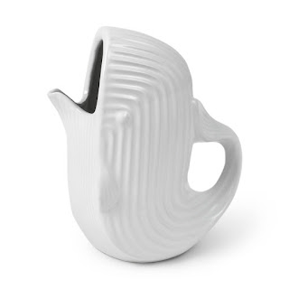
Jonathan Adler's work features a lot of animals, all done in a specific style. They are mainly all white in colour with textures such as stripes to show definition and avoid the piece just being smooth. Alongside this, these techniques make Adler's work more recognisable.

The forms are also abstract rather than focussed on being realistic, which is something I want to achive within my own models.

Ceramics / Sophie Woodrow


Sophie Woodrow is a ceramic artist who mainly works with porcelain. Her artwork is hand crafted, focusing on intricate details, humanistic animals merged with natural looking forms.

"Her work has been informed by an interest in the Victorians as the first generation who chose to define nature in opposition to what is human. In a spirit of wild curiosity, tinged with fear, the Victorians idolised nature, ‘packaging’ it into highly romanticised, palatable works of art. Our modern-day understanding is very different, so that we now interpret much Victorian art as ‘unnatural’ or kitsch" (source). 

Woodrow's work strays away from the 'norm' by utilising unnatural proportions, combining animals with human-like forms and the inclusion of a distinctive decorative style which contains patterns, textures and shapes. For example branch-like extensions, tentacles, barnacle-like texture, hats, human hands. Some of her pieces also lack limbs which reinforces the unnatural style which is both charming and uncomfortable, setting her work aside as her own.

I find this work highly inspiring due to the interesting forms, proportions and neglecting the realism side to ceramic arts. I am a beginner and it would be unrealistic to assume I would be able to produce something which mimics the real life beluga whale. On the contrary, I would prefer to create distinctive work which eventually will evolve into ceramics that could be traced back to my name, experimenting with patterns and shapes during modelling will give me more experience and push me to create unique and interesting pieces which fit the demographic and can be included within a brand, which is eventually where I would like to take the brief.

Ceramics / Inspiring Belugas

To get a further understanding (more than I currently do...) of how beluga whales look, I gathered a small collection of the most inspiring belugas which can influence my modelling. Of course, I want the belugas to look 'crafty' and abstract but it is also beneficial to have a comprehension of how they really look.


Although I'm very much against the idea of a beluga being in captivity, it is hard to say that a beluga wearing a hat is not cute. I would like to experiment with hats that the models can be wearing to give them character; including party hats, crowns, sun hats etc. I'd like to experiment with proportions, such as making really fat belugas or really long ones, maybe more round belugas or also exploring different shapes that aren't characteristic of belugas. Due to this brief being very experimental, it is hard to say what will look best, and it will only be through practice and experiments that I will find out what is successful.

Ceramics / The Brief


Brief


During Context of Practice, I began to experiment with facilities such as the ceramics room, and using materials. I wanted to translate this into a fun and different brief from my usual style, and try something new and refreshing. 


Create and brand a set of ceramic beluga whales, including relevant deliverables. Make people smile.


Considerations 


Consider who the audience will be and how this will effect the tone of voice. The brief can take many avenues and it is up to the designer to decide how to brand these products. Experiment with a selection of techniques and materials to find the most effective method of creating the belugas. 

Similarly to Haribo, this brief is for childish adults. The branding should reflect this, and look very childish and quirky, avoiding a tacky feel. Belugas should look very cute and fun for this niche market.


Deliverables

Ceramic beluga whales
Branding
Poster
Website
Other relevant collateral

Mandatory


Design blogs
Design boards 


Deadline

4 Months 


Analysis


I have loved beluga whales for as long as I can remember. Although my favourite animals consist of mainly sealife, belugas have the crown as my favourite animals in the world. From the production of my COP 03 ceramic project, I discovered how much I enjoyed being in the ceramics room, and problem solving. From this discovery I knew that I would like to undertake a more ceramics focused brief for Extended Practice, with more room to be lighthearted and not as stressed and serious.

At the heart of it, beluga whales make me happy - which was enough basis to form a brief. The idea was to create a range of ceramic beluga whales, which will help me gain experience and skill within the art of ceramics, and let me create something fun and enjoyable. It would increase my knowledge and understanding of the subject, as I have only briefly used the ceramic facilities, and I wish to become more familiar with it. The resolutions would hypothetically make other people happy if they were available for sale, which will demonstrate longevity and consideration for what it can become in the future. Since the belugas will be crafted myself, there is room for error, which will involve the use of problem analysis, critical awareness and utilising skills to overcome issues within the production.

Target audience will need to be considered in order to produce a resolution that is not entirely self indulgent. Adequate research into existing ceramic artists and collections will be necessary to make informed decisions, and gain a wider knowledge of artists in context.

Overall I plan to enjoy completing the brief, as that was the driving force for writing it, and hopefully this will be prevalent in my final outcomes and various deliverables.

Thursday, 26 January 2017

Metal Magazine / Demographic

Decided target audience: 18-30 year old males & females.

There are metal fans of all ages, however, some may not interact with publications such as Kerrang! and Rock Sound, which due to the content, appeals to a younger age range. Bands with a lower age range are featured frequently, such as Paramore, My Chemical Romance and Pierce the Veil, all bands which although will obviously have fans who are older, mainly attract a more teenage fanbase, meaning the publications will therefore attract the same fans who will want to read about their favourite bands.

For example in this chart the age range that the magazine Kerrang! attracts is shown:


Magazines such as Metal Hammer however feature more classic 'older' bands such as Metallica and Iron Maiden. However, this is not to suggest that bands such as these cannot attract younger audiences too. 

Therefore, due to the nature of the magazine and how it will be adopting a more minimalist treatment than existing publications, it will aim to appeal to a range of 18-30 year olds. It should be appropriately gender neutral, as the above graph shows that men are engaging with Kerrang! more than women. It should be an aim to try and change this to a more equal statistic. Both genders can enjoy heavy music.

The bands that will be in the publication will be mainly of the hardcore/metal genre. These bands themselves also seem to appeal to a younger demographic as I have observed from attending gigs. There are always more younger adults than older at these shows. Publications also offer a comfortable setting to read and interact with information about a band you may like. The magazine should aim to be a way for individuals to engage with music without committing to a mosh pit. 

Wednesday, 25 January 2017

Body Modification / Research / Design

Alongside the research content-wise, it was also important to research into influential designs which correlate with the concept and feel for the publication. 


Examples included utilising only type to create ambiguity and interest, allowing the publication to stand out on a shelf. This keeps the audience guessing what the content is, and perhaps would make them more inclined to pick it up and see. 

The use of one conceptual colour throughout is an appealing idea to create a strong visual identity and consistency. 

Experimenting with stock such as tracing paper or acetate could create a dynamic reading experience which is slightly different from the normal book. However, the concept should always be considered.


From research, it was established that the book should explore interesting uses of type, colour and stock choices to create a professional and interesting publication to match the engaging content. A plain publication would effect the content and not be appropriate, as body modification is a very vast weird and wonderful industry which needs to be reflected in the production and design choices throughout. 

Tuesday, 17 January 2017

Metal Magazine / Existing Magazines / The Problem & Solution


Problem

The problem I have identified, is that there is not a main stream magazine which contends with the likes of Kerrang!, Rock Sound or Metal Hammer, which does not adopt the same cluttered treatments. There are no magazines of this nature that is more minimally designed. When browsing these magazines, the clutter on the cover and inside spreads puts me off immediately. This may be to do with the fact that I enjoy a more pleasing composition to the eye, however I cannot be the only one.

Although these magazines have relevant content in relation to metal/rock music, they all have one thing in common - they look the same. The front covers are full to the brim with colour, full bleed imagery, type and banners. They adopt the same 'grunge' treatment, which obviously does communicate the genre of rock/metal and adds to the chaotic aesthetic, however I wonder how a metal magazine would look stripped back, but in keeping with the same content?

Would this still appeal to the demographic that purchases these existing magazines, or would it have a new audience range altogether, becoming more of a 'design-centred' niche magazine? This is something through research and exploration I will aim to find out.


Solution

A contemporary metal magazine which invites anyone who enjoys the genre to interact with. Abandoning all that metal publications are, stylistically, and doing something different to attract a new audience who may not enjoy the current publications out there due to their cluttered and out dated nature. Create a magazine which pushes boundaries and looks 'cool', dynamic and engaging. Give the audience more of a voice. 


Metal Magazine / Emails

Since social media is a great way to distribute information quickly, and pretty much anyone in the demographic is active on it, I posted on several facebook groups about an opportunity to feature in an alternative publication. The response I got was much better than anticipated, with multiple bands confirming their interest in the project and asking for more details.

This shows how local bands depend on any exposure, although I am just one person doing a publication, the end result will be to try and get the resolution out there, whether that be free newsprint version to start off with, finally leading to a glossy professional piece.


Unfortunately, some of the bands did not fit the criteria I had in mind. I want the publication to feature mainly bands on the hardcore scene, also rock/metal bands but not particuarly bands which I personally do not think would match the demographic of the magazine, for instance 'stoner metal' or an older style metal genre. The publication will be aimed at younger individuals in the alternative scene. 

Messages have been replied to, since I got these emails during the time I was completing context of practice, I told the bands I was interested in that I would contact  them around February concerning this.

Metal Magazine / Brief

Brief

There is a gap in the market for an updated metal magazine which does not follow a chaotic aesthetic, for a new audience of metal fans, which combines luxury publication design with heavy music. 

Create a current and contemporary metal magazine which challenges the existing aesthetic status of rock and metal publications available to purchase today. Through research, collaboration and concept, bring something new to the table 
which is inclusive and interactive for metal fans anywhere.


Considerations

Consider how the tone of voice can impact the design choices, and the audience that will engage with the publication. It is important to research the problems with current metal publications and aim to resolve this through concept and aesthetic decisions. Aim to create a magazine which is current and fresh.


Mandatory

Extended Practice Blog
Design boards


Deliverables

Printed publication
Posters
Website
Promotional video
Packaging considerations