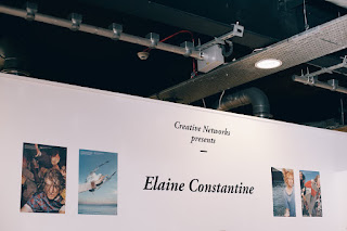
2015/16 Cycle offers a clean and minimal approach to the events, which does not concern itself with a high level of decoration, rather it focuses on the information and minimal image. This collateral appears very sophisticated and clean through the use of the serif type, which matches the credibility and professionalism that should be associated with events held by high profile guest speakers. However, it does not offer much of a unique concept, rather just a breathable aesthetic that may be successful with delivering information but not so much with engaging an audience.
The cycle for 15/16 is successful in that it uses mixed media and treats each event uniquely, catering to the guest speaker's style to provide an engaging design for each individual poster, however this hinders the consistency of the promotional material as a whole, which may differentiate each event from Creative Networks as a whole. These designs also use the LCA logo as an element, combining this with guest speaker's work to integrate the College and Creative Networks as a single unit.
This example which is also part of the 2014/15 is particularly striking through the use of large bright type, framing the image yet using techniques to highlight details. This definitely grabs attention which is crucial as the aim of the posters is to generate interest and attract plenty of individuals to the event. Although eye catching, this poster does not contain a lot of clear information on the event, i.e the location, time, or full name of the speaker - which is fundamental to a successful poster. It also does not have continuity with other posters from this cycle.


No comments:
Post a Comment