


Layout
In comparison, these are all examples of contemporary lifestyle magazines, with inside themes ranging from music to fashion. These magazines adopt a less cluttered composition treatment, containing a dramatically smaller amount of text content on the covers. This ensures the focal point is always the magazine's masthead. A correlation between all of these publications is a large, mostly central positioning, which the audience will naturally read first due to the way we read from top to bottom left to right. As for previous examples of metal magazines, the masthead is usually in a similar placement; but is sometimes obstructed by multiple subheadings. Having one key subheading provides a more focused composition.
Type
On existing metal magazines, the type ranges from sans serif, hand rendered, blackletter and slab serif. They are usually more heavy in weight to connote volume as metal music is notoriously loud. In these above examples, the type is still heavy in places, such as Clash or Dazed, however paired with a more uncluttered composition this enables the mast head to become the dynamic focal point without appearing over facing. Blackletter typefaces can represent calligraphy and a gothic period, which is obviously why rock magazines choose to use these, they communicate an eerie and dark tone. Hand rendered typefaces may be used in existing publications to reflect the anarchy and the rebellious connotations of the alternative subculture.
Within the above examples, sans serif is a popular choice due to its contemporary quality and legibility on a shelf. Magazines usually aim to attract shoppers passing by, so the cover needs to stand out among the rest and ensure readability. Serif typefaces have also been used such as on Russh and Fantastic Man; conveying a sense of elegance and sophistication, which can also communicate that the publication is of a high quality and luxury. Something to note when recreating my own publication. These magazines also contain a more minimal contemporary treatment in comparison to the textured 'grunge' nature of magazines such as Kerrang! and Rock Sound.
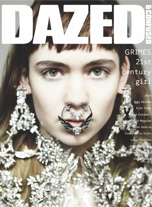
Image
Contemporary lifestyle magazines usually have one key image in relation to the issue, this can range from full bleed (Wonderland) to central (Fantastic Man, the Gentlewoman). The use of one image is again clean and focused, with no unnecessary distractions. The backgrounds are usually solid colour as demonstrated above, again providing a clean appearance. Metal magazines from the examples utilise multiple images throughout the cover, such as smaller scale icons promoting posters and other bands.
No comments:
Post a Comment