
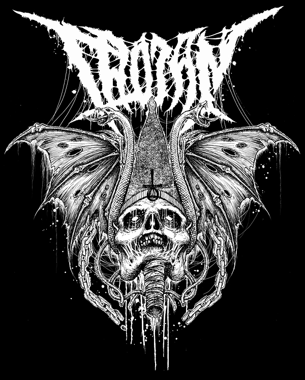
Mark Riddick is a 'reputable illustrator for the underground death metal music scene', designing logos for various heavy bands and incorporating a impactful and detailed style which is popular in the metal world. He has also even designed a logo for Justin Bieber in the same style.
Riddick has published two publications under the titles 'Logos from Hell', showcasing his work. I find his work highly inspirational in terms of this project, as I will be designing a metal logo myself to the best of my ability. Since I have never hand drawn a logo like this before, I will need to gather inspiration from existing works such as Mark Riddick, to set a certain standard that the logo will be.
It will be important to ensure the design looks symmetrical, abstract and even can be illegible. The aim is to create something recognisable as a whole, rather than focusing on it being readable, although a limitation to this is that it is a magazine masthead and it'll be the first thing the reader will see. Combining a metal logo like this with the clean aesthetic will create a dynamic juxtaposition and a unique composition which will engage the audience.
I learned a lot about the construction of metal logos from researching Mark Riddicks work, such as establishing the correct structure, drawing up loose ideas and adding detail later. Although I may not be a master yet, I can gauge where to start and develop from there.
No comments:
Post a Comment